WEB DESIGN STUDIO
INFO
PROJECTS
ELEANOR GILLESPIE
READING
HOTGLUE
PORTFOLIO
PROCESSING DEVELOPMENT
MOBILE DEVELOPMENT
PORTFOLIO
1. Design
2. Implementation
1. Designing My Portfolio
By using mind maps, structure diagrams, and wireframes I began planning the design of my portfolio.
Figure 1 is a quick sketch of the structure I thought my website should have. I think for a professional website it is important to have a static homepage as I feel they work better for showcasing work and to make it feel more like a full feature website.
I originally thought under the “projects” page I would categorise each post by date but soon after, I realised this was not an effective method for a portfolio, so I decided to categorise them differently, as seen in my flow diagram (Figure 2).
Figure 1 - Original plan for website structure
Figure 2 - Second design of structure
I have stayed quite true to my original page layout design (Figure 3) however I did end up changing one thing. My original plan consisted of when clicking on the “projects” page, links to all of my different projects (e.g “Hotglue”, “Portfolio” etc.) would come up horizontally across the page. After doing a trial run, I found that all of the projects titles wouldn’t fit onto the page. Therefore I changed the layout, stacking the links vertically, as seen in Figure 5. In Figure 6, there is a printscreen of my website with the adjusted navigation system.
Figure 3 - Original plan for website layout
Figure 6 - Printscreen of website "projects" page
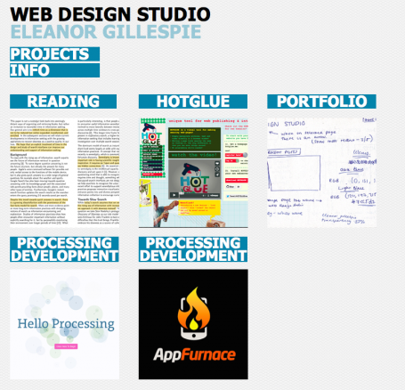
I wanted to make my portfolio easy to navigate through, which is why I made a simple navigation system and made the website design consistent throughout. Also, like many other online portfolios, I decided to add links to the individual projects on the homepage (Figure 5) along with images. This makes it clear what type of website it is, immediately engaging the viewer and showing the type of content on my page.
To plan the layout of the website, I used wireframes to show the basic structure of the pages.
Figure 3 is a quick sketch of what I vaguely wanted my website to look like. I then structured it properly in a wireframe (Figure 4).
Figure 4 - wireframe for website
Figure 5 - Second wireframe for website
Figure 7 - Printscreen of homepage

Building my portfolio was relatively easy as hotglue is an extremely simple tool to use and I had already done a lot of planning.
I created the first set of pages I needed which was easy as I just referenced the flow diagram I had already drawn. This included the home, projects and info page. Then by using the wireframes I drew, I created the home page, adding in the titles and first navigation menu. Then by using the “make this appear on all pages” tool, I was able to duplicate those elements on each of the pages. This tool meant all of the elements would be consistent on each page.
I then went on to making the second set of pages, which were the pages for each individual project (reading, hotglue, portfolio, processing development, & mobile development). I duplicated the other elements from the home page and then built the second navigation menu which will only appear in the project pages. On to the home page (Figure 8) , I added pictures and links to each individual project. I felt this made it feel more like a portfolio website. After doing that, I felt the basic structure of the website was done.
Figure 8 - screenshot of homepage
I felt like the website needed to be customised a bit more therefore I started thinking of the smaller things I could change which would increase the functionality of the website.
I changed the page titles on each page, which meant the page that the user is on is clearer in the tab (Figure 9). I think this gave a more professional feel to the website.
Figure 9 - changing the page titles
Another important feature I added to my portfolio was links that that jumped to anchors on the page. For example, on the “reading” page, I realised I would have a lot of different articles on there after a while, so I used some simple HTML to allow the text to be clicked and for it to jump to a specific part of the page. This was useful for the reading page as you can quickly jump to an article I have written about, however I have used this on multiple pages. Figure 10 is a video of me using this feature on the reading page.
Figure 10 - using anchors & links on my portfolio
I used the code
< div id="(anchor name is here)" >< /div >
and added it to the text box of the article title so it defined the anchor.
To link the text I used the “make object a link” tool and entered the web address plus "#anchor" e.g. https://elliegillespie.hotglue.me/portfolio/#two
click one to skip to that section!